Create a scatterplot in Google Sheets to visualize data trends effectively. Scatterplots are essential for analyzing correlations between two sets of data.
In business and research, scatterplots help in identifying patterns and relationships between variables. By using Google Sheets’ built-in functions, you can easily generate scatterplots to make data-driven decisions. In this guide, we will explore how to create and customize scatterplots in Google Sheets to enhance data visualization and analysis.
Whether you are presenting data in a meeting or conducting research, scatterplots in Google Sheets are a powerful tool for showcasing relationships and trends within your datasets.
What Is A Scatterplot
A Scatterplot is a type of data visualization tool used to display the relationship between two numerical variables. It is composed of defined ‘x’ and ‘y’ axes, with each data point representing a single observation. By mapping the data onto the axes and creating points to represent each observation, a Scatterplot allows for the visual examination of relationships and patterns within the dataset.
Definition
A Scatterplot, also known as a scatter graph or scatter diagram, is a visual representation of the relationship between two numerical variables. Each point on the Scatterplot represents the intersection of values for the two variables, providing a clear indication of the relationship between them.
Purpose
The primary purpose of a Scatterplot is to identify relationships or patterns between two numerical variables. It allows for the quick identification of correlations, clusters, and outliers, making it a valuable tool for data analysis and decision-making processes.
Creating A Scatterplot In Google Sheets
Learn how to easily create a scatterplot in Google Sheets to visualize data points and identify trends. Effortlessly plot your data and uncover valuable insights with this powerful tool.
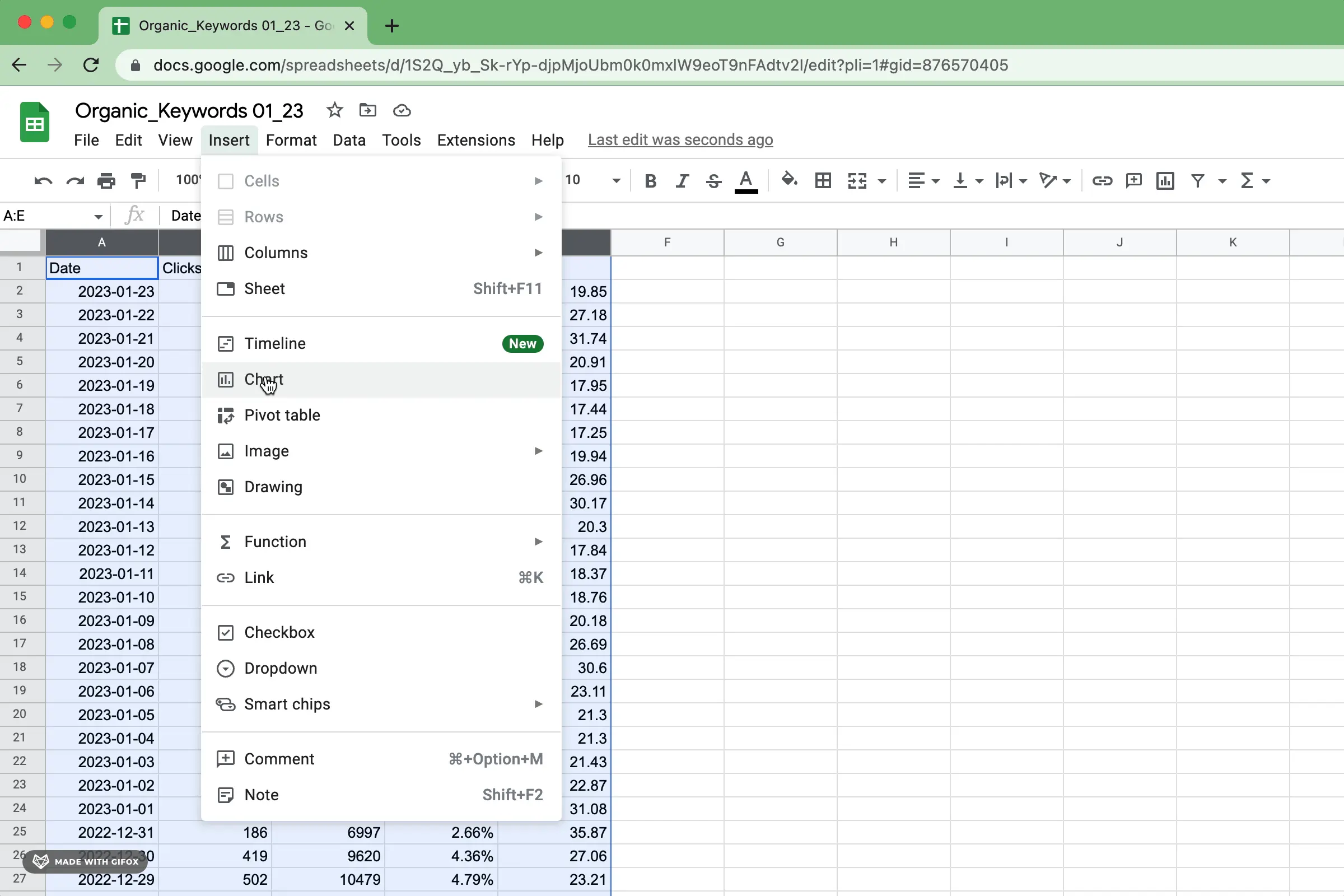
Creating a Scatterplot in Google Sheets is a great way to visualize data points and identify patterns. Step 1: Organize Data To start, ensure your data is organized with two columns, one for the x-axis values and the other for the y-axis values. Step 2: Insert Scatterplot Chart Insert a Scatterplot chart in Google Sheets by selecting the data range, clicking on the ‘Insert’ tab, and choosing ‘Chart.’ Your Scatterplot will now showcase the relationship between the variables.Customizing The Scatterplot
Customizing the Scatterplot:
Changing Chart Appearance
Adjust colors, fonts, and styles for a visually appealing scatterplot representation.
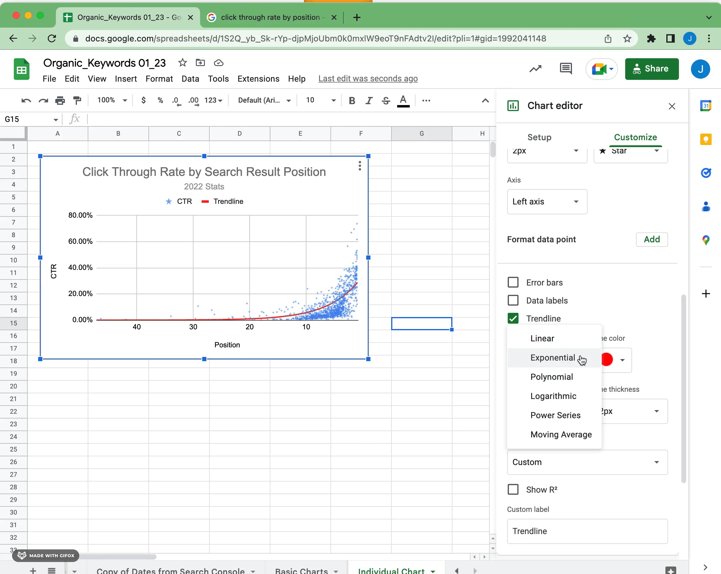
Adding Trendlines
Include trendlines to your scatterplot to analyze patterns and predictions.
Adjusting Axis Options
Modify axis values, scales, and labels for precise data interpretation.
Credit: www.superchart.io
Analyzing The Scatterplot
When it comes to analyzing a scatterplot in Google Sheets, it is essential to understand the patterns and correlations displayed in the data. By delving into the scatterplot, you can gain valuable insights and make informed decisions based on the relationships between variables.
Identifying Patterns
A crucial aspect of analyzing a scatterplot is identifying patterns within the data. Patterns can reveal trends, outliers, or clusters that provide meaningful information about the relationship between the variables being studied. By visually inspecting the scatterplot, you can easily observe any upward, downward, or random patterns that may exist.
Determining Correlation
Once patterns have been identified, the next step is determining the correlation between the variables. Correlation measures the strength and direction of the relationship between two variables. In a scatterplot, the clustered nature of the data points can indicate the strength, while the trend of the points can reveal the direction of the correlation. The closer the data points are to a straight line, the stronger the correlation between the variables.
Sharing And Collaborating On Scatterplots
The ability to share and collaborate on scatterplots is a valuable feature when it comes to data analysis. With Google Sheets, you can easily create and share scatterplots with others in just a few clicks. This allows for seamless collaboration and efficient communication, making it an ideal tool for teams working on data analysis projects. In this section, we will explore how to share scatterplots with others and the benefits of collaborating on data analysis using Google Sheets.
Sharing Scatterplots With Others
Sharing scatterplots with others using Google Sheets is simple and convenient, whether you are collaborating with colleagues or sharing your findings with clients or stakeholders. By following these steps, you can ensure that your scatterplots are accessible to others:
- Open your scatterplot: Access your scatterplot chart in Google Sheets by selecting the appropriate worksheet.
- Click on ‘File’: In the top left corner of your screen, click on the ‘File’ tab to open the drop-down menu.
- Select ‘Share’: From the drop-down menu, select the ‘Share’ option.
- Choose sharing settings: Choose the sharing settings that best fit your needs. You can select whether others can view, comment, or edit the scatterplot.
- Enter the recipient’s email: Simply enter the email address of the person or team you want to share the scatterplot with.
- Add a message: Optionally, you can add a personalized message to further explain the scatterplot or provide additional context.
- Click ‘Send’: Once you have set the sharing settings and added the recipient’s email and message, click the ‘Send’ button.
- Collaborate in real-time: The recipient will receive an email with a link to the scatterplot, allowing them to view or collaborate on the data analysis in real-time.
Collaborating On Data Analysis
Collaborating on data analysis using Google Sheets’ scatterplot feature enhances teamwork and productivity. Here’s how you can collaborate effectively with your team:
- Real-time editing: Google Sheets enables multiple users to edit a scatterplot simultaneously, eliminating the need for version control issues and speeding up the data analysis process.
- Comments and suggestions: Team members can leave comments and suggestions directly within the scatterplot, facilitating clearer communication and encouraging collaboration.
- Easy data importing: Google Sheets provides seamless integration with other data sources, allowing team members to import data from various platforms and continue their data analysis within the scatterplot.
- Revision history: The revision history feature in Google Sheets enables users to track changes made to the scatterplot, identify who made the changes, and restore previous versions if needed.
By sharing scatterplots and collaborating on data analysis through Google Sheets, you can streamline your team’s workflow, improve decision-making processes, and enhance overall project outcomes.

Credit: www.youtube.com

Credit: www.benlcollins.com
Frequently Asked Questions Of Scatterplot Google Sheets
How Do I Make A Scatter Plot On Google Sheets?
To create a scatter plot on Google Sheets, enter your data, select the range, click “Insert,” then “Chart. ” Choose “Scatter” from the Chart Editor. Customize as needed, and click “Insert” to add the scatter plot to your Google Sheet.
How To Make A Scatter Plot In Google Sheets With Two Sets Of Data?
To create a scatter plot in Google Sheets with two sets of data, select both sets, click Insert > Chart > Scatter plot.
How Do I Plot An Xy Graph In Google Sheets?
To plot an XY graph in Google Sheets, enter your data, select it, click Insert > Chart > XY chart.
How Do You Make A Scatter Plot Matrix In Google Sheets?
To create a scatter plot matrix in Google Sheets, go to “Insert” and select “Chart. ” Then choose “Scatter plot” and customize the data ranges for the matrix. Finally, click “Insert” to add the scatter plot matrix to your sheet.
Conclusion
To sum up, using scatterplot in Google Sheets is advantageous for visualizing data relationships. It’s user-friendly, free, and powerful. With easy access and customizable features, it’s a great tool for analysts and decision-makers. So, next time you’re dealing with data, don’t forget to utilize scatterplot in Google Sheets for better insights!