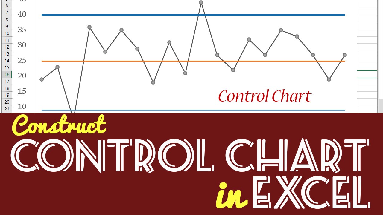
To make a control chart in Excel, go to the Insert tab, select Scatter with Straight Lines. Using your data points, create the upper and lower control limits as additional series on the chart.
Control charts are essential tools for quality control in various industries, allowing you to monitor processes over time and identify any deviations. By creating a control chart in Excel, you can visually analyze your data, detect patterns, and make informed decisions based on statistical analysis.
This guide will walk you through the step-by-step process of creating a control chart in Excel, helping you streamline your quality control efforts and improve overall process efficiency. Let’s dive in and learn how to leverage Excel’s capabilities to implement effective quality control measures through control charts.
Credit: www.vertex42.com
Step 2: Create A Control Chart
Selecting The Data
To start creating a control chart in Excel, the first step is to select the data points that you want to include in the chart. Make sure that you have a clear understanding of what process or system you are trying to monitor and improve. For example, if you are tracking customer satisfaction scores over time, you will need to gather the relevant data points related to these scores, such as monthly or quarterly survey results. Once you have your data points identified and organized in Excel, you can then move on to the next step of creating the control chart.
Inserting A Scatter Plot
After selecting the data, the next step is to insert a scatter plot in Excel. Click on the “Insert” tab, then select “Scatter” from the chart options. A scatter plot will provide a visual representation of the relationship between the data points. This will serve as the foundation for your control chart. Remember to select the appropriate data range for the X and Y axes to ensure that the scatter plot accurately reflects your data points.
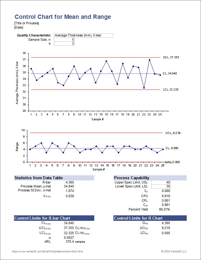
Adding Control Limits
Once you have inserted the scatter plot, the next crucial step is to add control limits to the chart. The control limits indicate the acceptable range of variation for the process or system being monitored. To add control limits, you will need to calculate the upper and lower control limits based on your data. In Excel, this can be done by using specific formulas such as the average and standard deviation functions. These calculated control limits can then be added to the scatter plot to visually represent the acceptable variation range. This step is essential in identifying any outliers or abnormal patterns in the data.

Credit: keys.direct
Step 3: Interpret The Control Chart
After creating a control chart in Excel, move on to interpreting the data displayed. Look for patterns or trends that indicate process stability or variation. Use the chart to make informed decisions and implement any necessary improvements.
Once you have created your control chart in Excel, the next crucial step is to interpret the data it presents to you. This process involves identifying outliers and analyzing patterns within the chart.
Identifying Outliers
Outliers are data points that fall significantly outside the normal range of variation. To identify outliers on a control chart, look for points that are above or below the control limits. These points may indicate special causes of variation that need to be investigated further.
Analyzing Patterns
Patterns on a control chart can reveal valuable insights about the process being monitored. Common patterns to look for include trends, cycles, and shifts. Trends may indicate a gradual change in the process over time, while cycles suggest recurring patterns of variation. Shifts, on the other hand, signal abrupt changes that require immediate attention.

Credit: www.statology.org
Frequently Asked Questions Of How To Make A Control Chart In Excel
How Do I Create A Control Line Chart In Excel?
To create a control line chart in Excel, go to the “Insert” tab, choose “Line Chart,” then select “Line with Markers. ” Next, input your data and customize the chart as needed. This will help you visualize and analyze control limits for your data.
How Do You Make A Control Chart?
To create a control chart, follow these steps: 1. Collect data on a process you want to monitor. 2. Calculate the average and standard deviation of the data. 3. Plot the data points on a chart. 4. Draw the upper and lower control limits based on the average and standard deviation.
5. Analyze the chart to identify any trends or out-of-control points.
How Do I Create A Control Sheet In Excel?
To create a control sheet in Excel, follow these steps: 1. Open Excel and create a new workbook. 2. Label the columns with the required information. 3. Enter data in the rows. 4. Apply formatting as needed for clarity. 5.
Save the sheet.
How Do I Create A Stock Control Chart In Excel?
To create a stock control chart in Excel, input your data and select it. Then go to the “Insert” tab, click on “Bar Chart,” and choose “Clustered Bar. ” After that, right-click on the chart and select “Select Data” to adjust your chart settings.
Conclusion
Creating a control chart in Excel is an essential tool for monitoring and improving processes. With the step-by-step guide provided, anyone can easily leverage this powerful tool to analyze data and make informed decisions. By tracking variation and identifying trends, businesses can proactively address issues and drive continuous improvement.
Embracing the benefits of control charts in Excel is a worthwhile investment for any organization.