To create a scatter plot in Google Sheets, select your data, go to Insert, Chart, and choose Scatter plot. Data visualization is crucial for understanding trends.
Scatter plots in Google Sheets are an effective tool for analyzing relationships between variables. By following simple steps, you can create a visual representation of your data points, making it easier to identify patterns and correlations. Whether you’re tracking sales data or conducting scientific research, scatter plots allow you to interpret your data at a glance.
We will guide you through the process of making a scatter plot in Google Sheets, empowering you to present your data in a clear and insightful way. Let’s dive into the world of data visualization using scatter plots in Google Sheets.

Credit: www.benlcollins.com
Step 1: Setting Up The Data
When creating a scatter plot in Google Sheets, the first step is to set up the data properly. This involves preparing the spreadsheet and organizing the data in a way that is conducive to creating an accurate and visually appealing scatter plot.
Preparing The Spreadsheet
Before diving into the data, it’s important to ensure that the spreadsheet is set up in a way that will make creating the scatter plot as smooth as possible. This includes labeling the rows and columns clearly and ensuring data consistency throughout the spreadsheet.
Organizing The Data
Once the spreadsheet is ready, the next step is to organize the data itself. This involves ensuring that each variable is in its own column, and that the data is entered accurately and completely. Each row of the spreadsheet represents a single data point, with each column corresponding to a different variable.
Credit: www.superchart.io
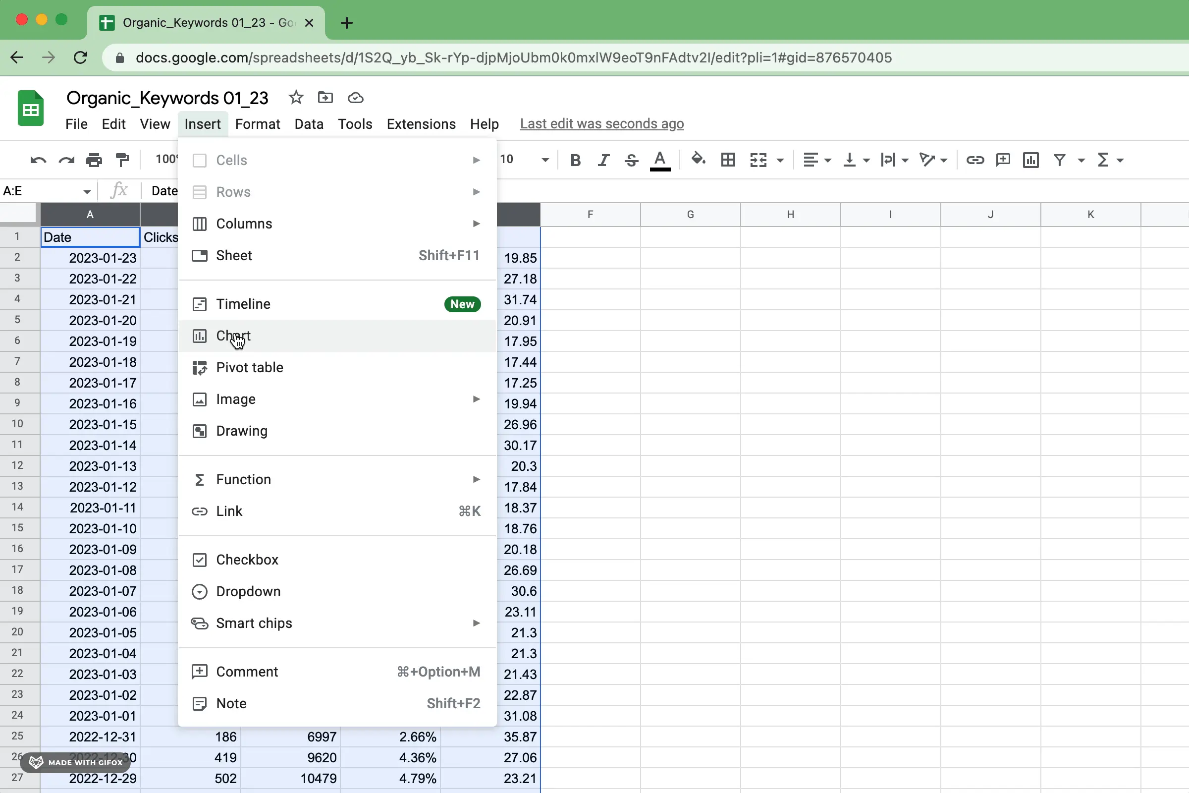
Step 2: Inserting The Scatter Plot
Open Google Sheets
To make a Scatter Plot in Google Sheets, first open the Sheets app.
Select The Data Range
Next, select the data range you want to include in the Scatter Plot.
Click On The Insert Menu
Once the data range is selected, click on the Insert menu at the top.
Choose The Scatter Chart Option
From the dropdown options, choose the Scatter chart option.
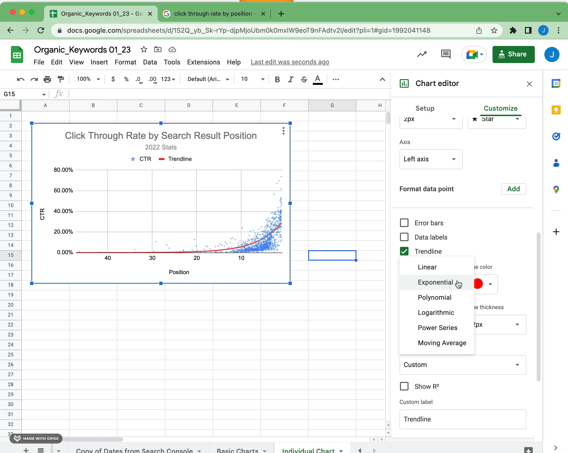
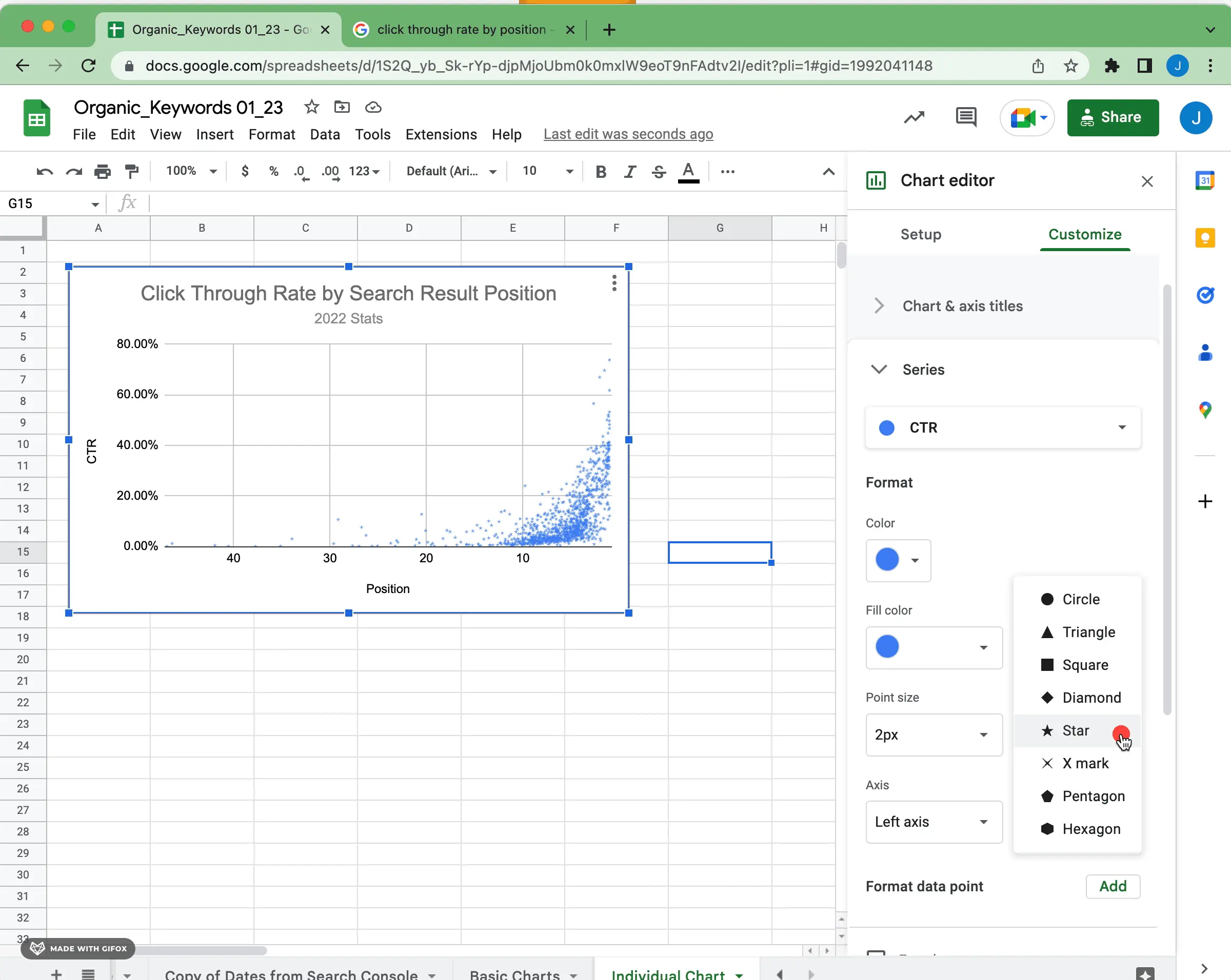
Step 3: Customizing The Scatter Plot
Step 3 of making a scatter plot in Google Sheets involves customizing the plot to suit your needs. This allows you to adjust the appearance, labels, and other elements to create a visually appealing and informative scatter plot.
Changing The Chart Type
Google Sheets makes it easy to change the chart type of your scatter plot.
If you want to modify the appearance, simply click on the chart to select it.
Adjusting The Axis
- Customize the horizontal and vertical axes to display specific data ranges.
- Click on the chart and select “Advanced edit” to fine-tune axis settings.
Adding Labels And Titles
To enhance clarity, include labels and titles to your scatter plot.
- Click on the chart and choose “Customize” to add titles.
- Labels can be inserted via the “Chart & axis titles” tab.
Applying Visual Elements
| Adds visual elements | such as gridlines or data points. |
|---|---|
| Access “Customize” | to personalize your scatter plot further. |
Step 4: Analyzing The Scatter Plot
Now that you have created a scatter plot in Google Sheets, it’s time to analyze the data and derive insights from the visualization. This step is crucial in extracting meaningful information from the plotted points, which can provide valuable insights into the relationship between the variables being analyzed.
Interpreting The Data Points
When analyzing a scatter plot, it’s important to interpret the individual data points represented on the graph. Each point corresponds to a specific pair of values from the data set, and understanding what each point signifies is essential for drawing accurate conclusions from the plot.
Identifying Patterns And Trends
One of the primary objectives of analyzing a scatter plot is to identify any discernible patterns or trends within the data. By visually examining the distribution of points on the plot, you can determine whether there is a clear relationship between the two variables being plotted.
Analyzing Relationships
Scatter plots are particularly useful for analyzing the relationships between variables. By examining the overall pattern of the plotted points, you can gain insights into the nature of the relationship, such as whether it’s linear, quadratic, or exponential.
Finding Outliers
Another important aspect of analyzing a scatter plot is the identification of outliers. These are data points that deviate significantly from the general pattern of the plot and may have a substantial impact on the relationship being analyzed.
Credit: www.superchart.io
Frequently Asked Questions On How To Make A Scatter Plot In Google Sheets
How To Make A Scatter Plot In Google Sheets With Two Sets Of Data?
To create a scatter plot in Google Sheets with two sets of data, select the data, including both sets, go to “Insert” in the menu, and choose “Chart. ” In the Chart editor, select “Scatter” as the chart type, and Google Sheets will plot the two sets of data on the scatter plot.
How Do You Make An Xy Graph In Google Sheets?
To make an XY graph in Google Sheets, go to Insert > Chart. Select “Chart type” and choose “Scatter. ” Enter your data range and customize your graph. Click “Insert. ” You now have an XY graph in Google Sheets.
How Do You Make A Scatter Plot Matrix In Google Sheets?
To make a scatter plot matrix in Google Sheets, select the data you want to plot, click on “Insert”, choose “Chart”, then select “Scatter plot”. Customize the chart as needed for analysis.
How Do I Plot A Graph In Google Sheets?
To plot a graph in Google Sheets, select data > Insert chart > Choose the chart type > Customize as needed.
Conclusion
Creating scatter plots in Google Sheets is a valuable skill for anyone working with data. With the easy-to-follow steps outlined in this guide, you can quickly visualize relationships between variables. As you become more familiar with scatter plots, you’ll find that they are an essential tool for understanding and analyzing data effectively.
Happy plotting!